 UR
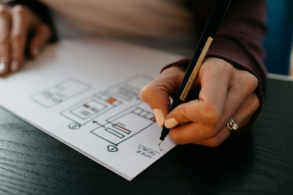
When clients ask for a website that “looks premium”, they rarely mean more effects. They mean a site that feels confident, considered and trustworthy. That comes from a set of disciplined design choices.
1. Restraint
Premium design says less, more clearly. One main message per section, one primary action, and plenty of room around both. Every extra badge, animation and colour dilutes the effect.
2. Typography
A well-chosen typeface, used at a limited number of sizes and weights, does more than any graphic. Comfortable line length, generous line height and a clear hierarchy make text feel effortless to read.
3. Spacing
Consistent spacing is one of the clearest signals of quality. Elements aligned to a grid, equal gaps between related items and larger gaps between sections create calm, even when there’s a lot of content.
4. Real imagery
Real photos of your work, team and space build trust in a way stock images can’t. If you must use stock, choose images that are specific and consistent in style. Invest in professional content when you can.
5. A restrained colour palette
A neutral base with one or two brand accents feels more premium than many competing colours. Use the accent for actions and emphasis, not decoration.
6. Motion with purpose
Subtle transitions that guide attention feel polished; constant movement feels busy and slows the site. Motion should never delay content.
7. Speed
Nothing feels less premium than waiting. A fast site feels expensive. Optimise images, limit scripts and test on a real phone.
8. Details that work
Hover and focus states, readable forms, helpful error messages, a good 404 page and consistent icons. Visitors may not notice each detail, but they notice when they’re missing.
Premium design is rooted in a clear brand and careful UX. If you’d like your website to feel like the quality of your work, explore our web design services.
 Web Development · 7 min read
 Business Growth · 6 min read